


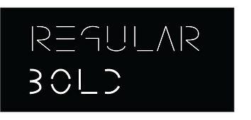


Crevices is a font I created from start to finish. It is the simplification of letters, leaving only the necessary parts of a letter for it to be legible. Parts of a letter were removed or kept such as the stem, crossbar, bowl, and etc. Korean characters were also designed using the crevices aesthetic in order to present the dissected parts used to create a character in this language.

A crevice is a narrow opening or fissure that
can be found in a rock or wall. Crevices has
been inspired by rocks and mountain ranges. All the nooks and crannies of these mountain ranges come together to create a shape,
a shape we see such as a mountain.


Crevices is a display typeface. I applied it to Kintori's logo. Kintori is a car club based in the 626 area. The logo shown is a draft that has been confirmed by the founder of Kintori, Jacky Cheng. It is currently under construction.


